We write a lot about specs on this site. Swing weight, stiffness, string patterns, power levels, control, comfort etc. In this post we get into something else: racquet cosmetics.
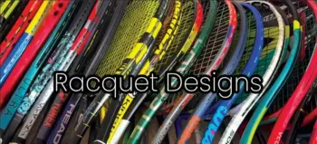
What are the best-looking tennis racquets of all time? It’s a completely subjective question and there’s no right answer, but cosmetics matter more than we like to admit. A racquet can play brilliantly, but if you really don’t like the paint job, it somehow becomes a little less exciting to pull out of the bag. Judging by the comments I get whenever a new racquet launches, I’m clearly not the only one who feels this way. People will say things like “if they released the prototype cosmetic I’d buy it immediately” or “if this one came in black I’d get one today.” Looks sell racquets, whether we admit it or not.
Why cosmetics matter more than we think
We’ve all seen it happen: a brand teases a racquet in a simple blacked-out prototype design, everyone gets excited, and then the retail cosmetic shows up and the reaction is a collective “hmm.” Limited editions exist partly because of this. They give an existing model a bit of extra life, and if the cosmetic is good enough, suddenly racquet nerds and collectors have another reason to buy a frame they definitely don’t need. I’ve been guilty of that more than once.
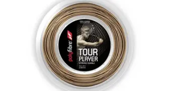
Strings play into this too, by the way. You can find a string and racquet combo that plays perfectly but still looks awful together – put bright pink string in the wrong red frame and the whole racquet becomes hard to look at. That’s part of why I generally lean toward neutral string colors, such as VAMOS!
Anyway, let’s get into some actual racquets.
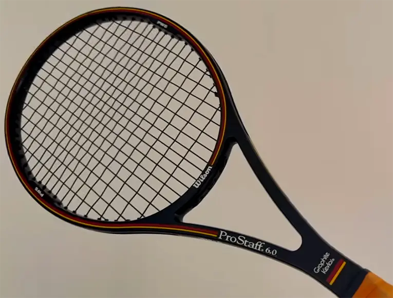
Wilson Pro Staff 85
Might as well start with a classic. The Pro Staff 85 is probably one of the prettiest racquets ever made: black base, red and yellow stripes, nothing unnecessary going on. It just looks classy, and honestly it deserves a spot in any collection before you even get into the history or how it plays. Modern cosmetics often try to make a big statement; the Pro Staff 85 never needed to. It just looks like a tennis racquet is supposed to look.
Wilson’s car-dazzle Clash
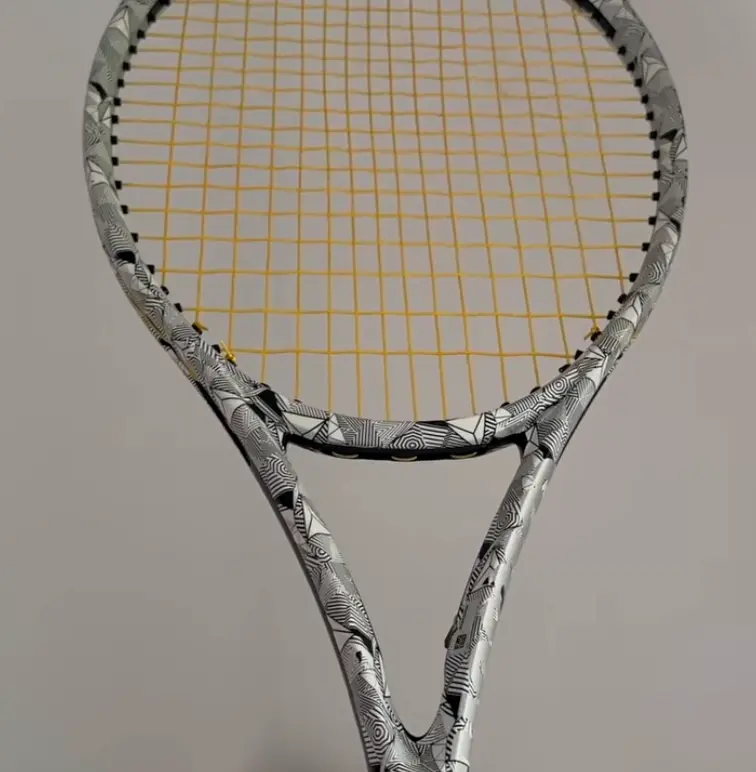
One of the more unusual pieces in my collection is the “car dazzle” cosmetic Wilson used before the Clash launched – that camouflage pattern car manufacturers use on prototypes to hide the body lines underneath. Wilson did something similar here, and I think it looks fantastic, maybe one of the coolest cosmetics they’ve ever done. It helps that I found mine cheap in a bargain bin at the Swedish Open, which always makes a racquet look a little better. Sometimes you just get lucky.
Visit the official Wilson site here to see their current offers.
The old Babolat Soft Drive
This one’s personal. The Soft Drive is one of my favorite racquets, and it has that proper old-school look, decals and design touches you rarely see anymore. Rafa used it as a junior too, which gives it a nice bit of history. Older racquets tended to be busier visually, but a lot of them still had real character without looking like someone opened Photoshop and clicked every available effect. There’s something charming about those old cosmetics that’s hard to put into words.
AeroPro Drive: busy, but iconic
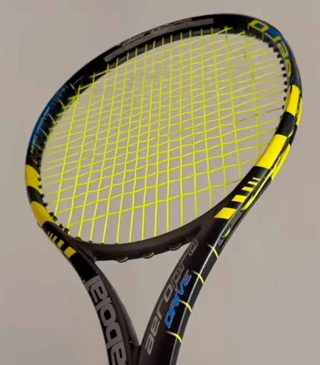
Speaking of Rafa, the original AeroPro Drive is an interesting case. There’s a lot going on, probably too much by modern standards, but because we associate it so strongly with Rafa and that whole era of tennis, the cosmetic has become iconic anyway. This is where nostalgia gets hard to separate from actual design quality. Is it objectively beautiful? I honestly don’t know. But you see one and you instantly know exactly what it is, and that counts for something.
Head Pro Tour 630 / 280
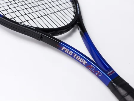
Another classic, known as the Pro Tour 280 in the US – this is the frame that eventually got tied to the legendary PT57A pro stocks. The cosmetic is clean, elegant, and instantly recognizable, and the reissue wisely kept the same look. It’s also one of my favorite racquets ever in terms of feel. For my game today it’s probably a bit too demanding, I struggle to generate enough pace with frames like this now, but when you catch the sweet spot properly, it’s beautiful. And it looks beautiful too.
Prestige cosmetics rarely miss
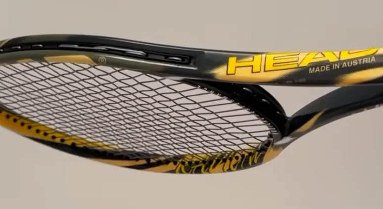
Head has put out plenty of great Prestige designs over the years, and the old burgundy-red versions in particular have aged really well. My friend Ben has a decent Prestige collection, and going through his frames is a good reminder of how consistently good that line has looked. Prestiges generally have that serious, traditional player’s-frame feel – they look like tools, not toys, and I mean that as a compliment.
Radical Zebra and Bumblebee
Then there are the properly nostalgic Head designs. The Radical Zebra is not subtle in the slightest, but it’s become a classic, and those old Radicals were also absolute sledgehammers in terms of swing weight compared to most modern frames. The Agassi Bumblebee Radical is another one that instantly transports you back to a specific era of tennis. Would either design survive a modern brand meeting? Probably not. But that’s part of why they’re fun.
Federer-era Wilson racquets
Wilson had some genuinely strong cosmetics during the Federer years – there was just a bit more imagination in some of those designs. Nostalgia obviously plays a role here too. Rewatching old Federer–Nadal matches, you find yourself remembering not just the tennis but the racquets, the clothes, the whole look of that period. I still enjoy watching Sinner and Alcaraz now, but Federer versus Nadal was something else entirely.
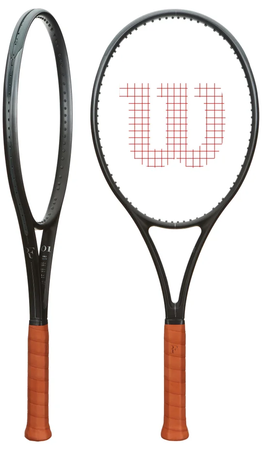
The current RF racquet looks good too, and the white-and-gold anniversary edition was particularly nice, but compared with some of Federer’s older Autograph cosmetics, the standard RF design feels a touch more understated. Maybe the next version pushes it further.
Babolat Pure Strike Carbon
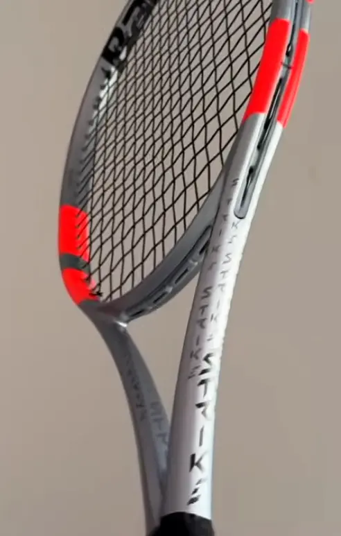
One of the prettiest modern racquets, for me, is the Pure Strike Carbon edition. It has that silver, or “carbon,” as Babolat calls it, finish that works really well. The regular white-and-red Pure Strike was already pretty recognizable, but this one feels more premium. Clean, classy, and I’m curious to see where Babolat takes the Strike line next, since it’s always had its own identity.
Wilson Ultra Pro
Another great-looking modern frame. It’s essentially the H19 platform for anyone into the pro-stock rabbit hole, and it has that traditional thin-beam player’s-racquet look – nothing crazy, nothing trying too hard. Just a nice-looking tennis racquet, and sometimes that’s genuinely enough.
Tecnifibre and the white racquet
I’m generally a fan of Tecnifibre and their approach to cosmetics. They’ve committed heavily to white, which I know isn’t for everyone, but I think it works well, especially with a glossy finish. The T-Fight special editions look particularly good because they start from that clean white base and add just a few details instead of piling everything on. Clean tends to win.
Prince Tour 98
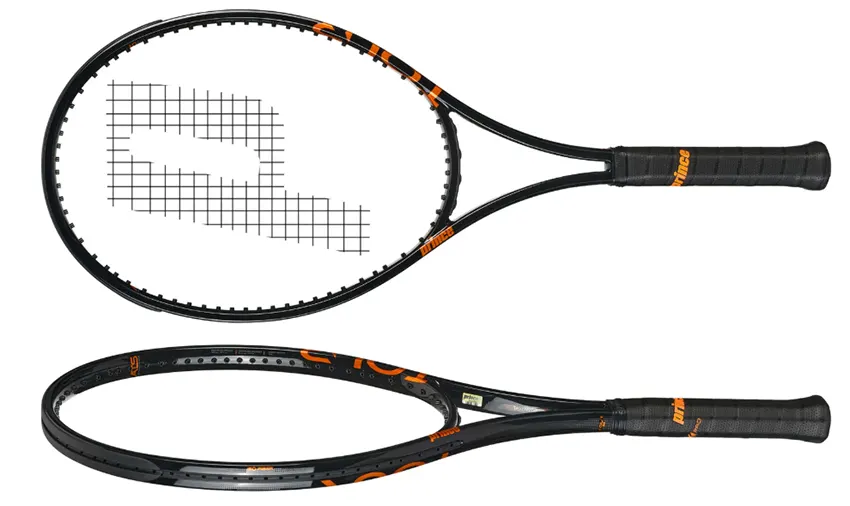
The newer Prince Tour 98 is another one they got right, with glossy finish, some orange detailing, a long throat. It just looks good, and I genuinely think cosmetics like this help sell racquets. I don’t have data to prove it, but when two racquets perform similarly and one looks noticeably better, which one do you think most people pick up first?
Diadem Elevate V4
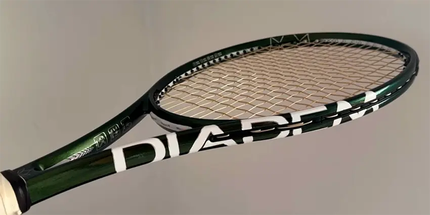
The new Diadem Elevate V4 is a good recent example of how much a cosmetic can shift the perception of a racquet. The racing-green look is really nice and feels more premium than earlier generations. I wouldn’t be surprised if that alone gets the racquet more attention. It’s still a fairly flexible, control-oriented frame and not the easiest for free power, but cosmetically, it’s a winner.
Blade V8
If we’re talking Blade cosmetics, my favorite might still be the V8. That shifting green finish looked excellent, and conveniently the racquet itself was one of the better Blade generations in terms of playability too. The K Blade deserves an honorable mention here as well.
Sometimes simpler is better
Looking back over the collection, I gravitate toward cleaner cosmetics more often than not. Black works. White works. Deep green, burgundy, silver… these colors tend to age well, and gloss finishes seem to be making a bit of a comeback too, which I like. A good glossy finish can make a racquet look far more premium than it has any right to.
That doesn’t mean busy designs can’t work, if a brand manages to make a complicated cosmetic feel coherent, that’s arguably more impressive. It’s just much easier to get wrong.
When cosmetics go wrong
And yes, there have been plenty of ugly tennis racquets. Some older cosmetics have aged so badly they now look like junior frames – strange graphics, too many colors, random text scattered everywhere. The good news is brands tend to improve fast from one generation to the next. Sometimes the racquet barely changes at all, but a new cosmetic alone is enough to make you want to try it. Marketing departments know exactly what they’re doing there.
Clean or crazy?
That’s really what makes this topic fun. Do you prefer something incredibly clean like an old Pro Staff, or something completely unmistakable like an AeroPro Drive, a Radical Zebra, or one of the wilder limited editions? And how much does nostalgia shape your answer? For me, quite a lot. A racquet can remind you of Federer, Rafa, Agassi, Edberg, Graf, or whoever you watched growing up, and suddenly it means a lot more than just the colors painted onto the graphite. That’s an emotional connection a new racquet can’t really recreate.
Still, brands are putting out some genuinely excellent cosmetics right now, and limited editions keep coming (check them out in our racquet blog). So I’m curious – what’s the best-looking racquet available today? And, more importantly, what’s the best-looking racquet of all time? Give us your opinion in the comments below.